19 Pottery Painting Ideas for Creative and Eye-Catching Designs
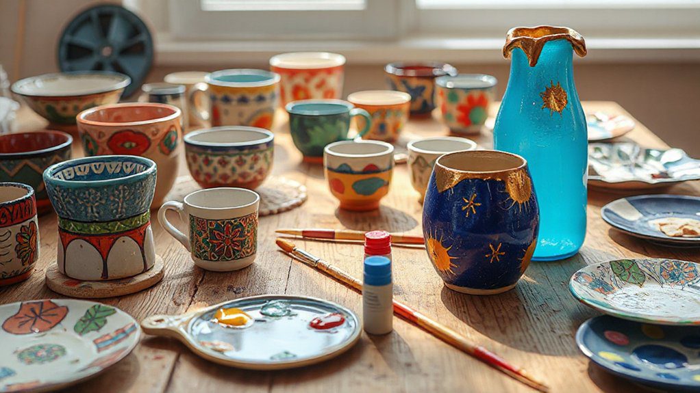
I’ll give you 19 pottery painting ideas that look bold fast: polka dots, sponge stripes, color blocking, taped triangles, rim bands, grids, minimalist charcoal, all-white with a crisp edge, boho mandalas, tribal lines, splatter texture, dry-brushed highlights, swirls, metallic accents, roses, daisies, leafy borders, seasonal pumpkins or snowflakes, plus tiny animals like ladybugs or a cheeky frog. Paint thin coats, clean the surface, and test colors first—there’s more ahead to help you nail the finish.
Love cozy DIY projects? 💕
Get free printable guides, exclusive tutorials & surprise craft goodies straight to your inbox.
Disclosure: This post may contain Amazon affiliate links, at no extra cost to you. Content on DiyCraftNest is created with research support from AI tools and carefully reviewed, edited, and fact-checked by the lead author, Daniel Pat, to ensure accuracy and reliability. Learn more
Key Takeaways
- Use color blocking on bowls and plates to create bold sections with high-contrast palettes for instant visual impact.
- Apply painter’s tape to paint crisp geometric stripes, triangles, or grids, then peel for clean, modern lines.
- Paint floral rims or leafy borders with simple daisies and vines, layering thin coats for depth and neat edges.
- Try whimsical motifs like frogs, ladybugs, or tiny animals as focal points, adding small details near the rim.
- Rotate seasonal themes—pumpkins, snowflakes, spring buds, summer fruit—testing colors first to avoid unexpected firing shifts.
Simple Pottery Painting Ideas for Beginners
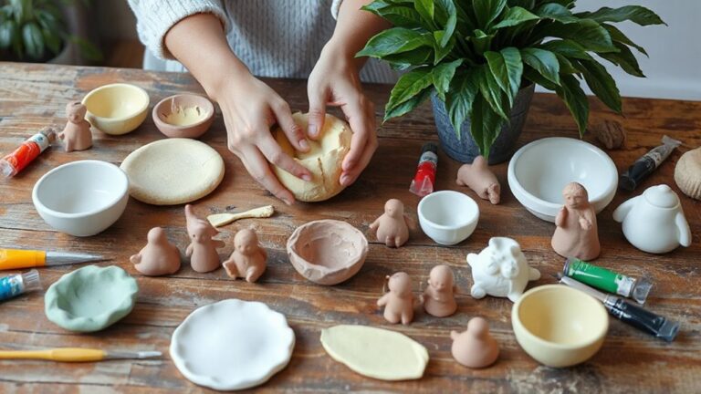
Although pottery painting can look intimidating at first, I’ve found beginners get the best results by starting with simple, bold designs that are easy to control and still look amazing.
If you’re new, you’re in good company—let’s make something you’ll be proud to share.
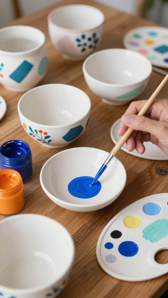
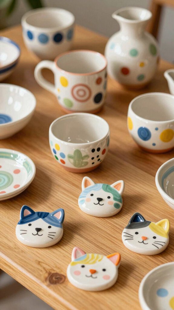
First, try polka dots or stripes. I dab paint on with colorful sponges for quick, even marks, then add one brush color to tie it together.
Next, use painter’s tape to block off triangles or bands; paint the open spaces, peel the tape, and you’ll get crisp lines that look pro.
For a personal touch, I add playful quotes in bubble letters or neat block fonts.
Finally, paint easy flowers or leaves, or go seasonal with fruit and simple holiday icons.
Modern Minimal Pottery Designs
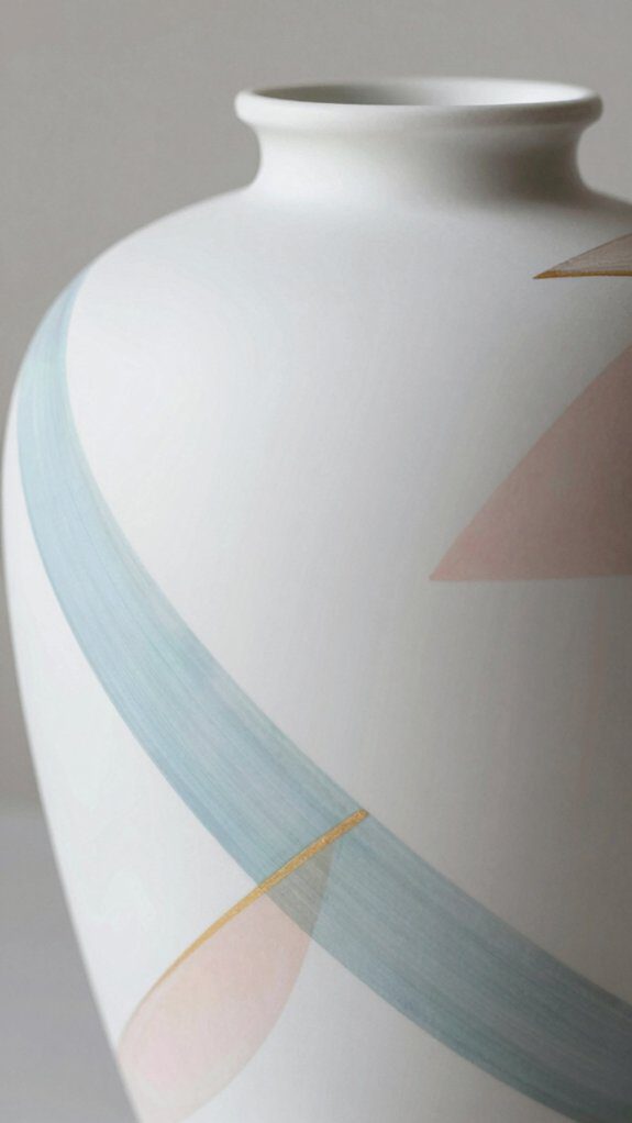
When I want a pottery piece to look sleek and modern, I keep the design super simple and let clean lines do most of the work. You can get that gallery-ready vibe with minimalist color palettes like all-white, charcoal, or a soft two-tone band.
I love using geometric forms—think triangles, grids, or one bold stripe—because they feel sharp without getting busy.
To make your piece feel balanced and “you belong here” polished, try this:
- Leave generous negative space to spotlight the shape
- Paint one crisp line around the rim or base
- Choose matte finishes for a calm, modern look
- Add an unglazed patch for natural texture contrast
- Repeat one small pattern for quiet rhythm
Boho-Inspired Pottery Painting Styles
Minimal pottery feels like a calm, quiet room—boho pottery feels like opening the windows and letting the sunlight, plants, and music rush in.
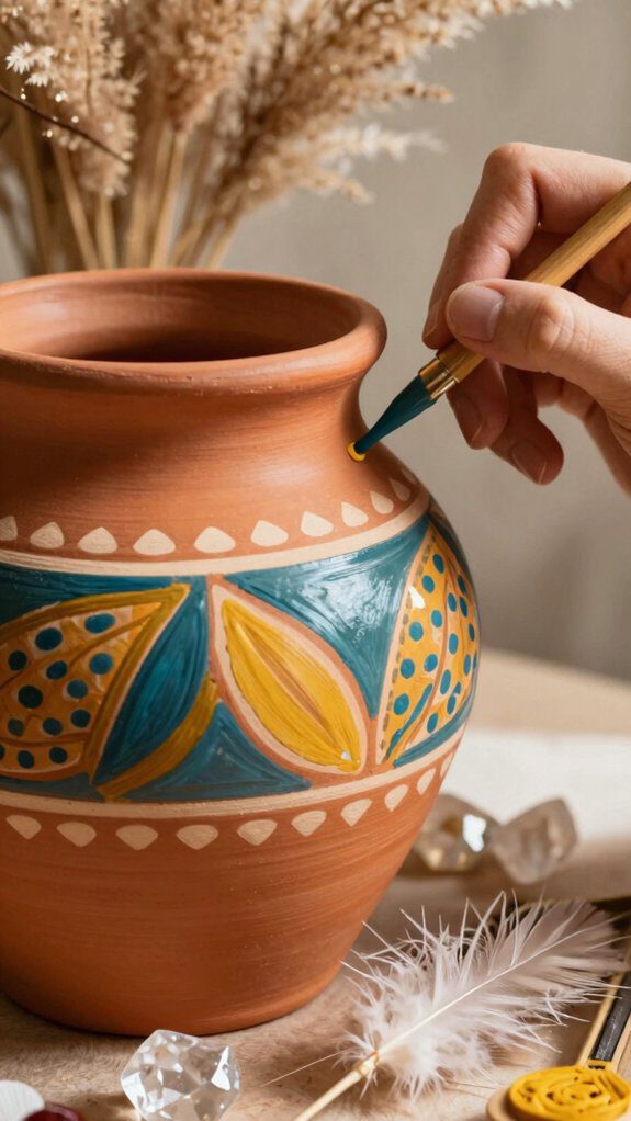
If you want your piece to feel welcoming, start with earthy colors, like clay browns, warm terracotta, and soft sage.
Next, sketch loose boho patterns: mandalas, abstract shapes, or tribal-inspired lines. I like to mix two or three styles so it feels collected, not perfect—kind of like a favorite bracelet stack.
To add depth, I layer paint with a sponge, then flick tiny splatters for texture.
Finally, make it yours. Add a small feather or dreamcatcher symbol, or write a short quote that reminds you you belong here.
Floral and Nature-Themed Pottery Ideas
If you want your pottery to feel like a little walk outside, floral and nature-themed designs make it easy to add that fresh, peaceful vibe.
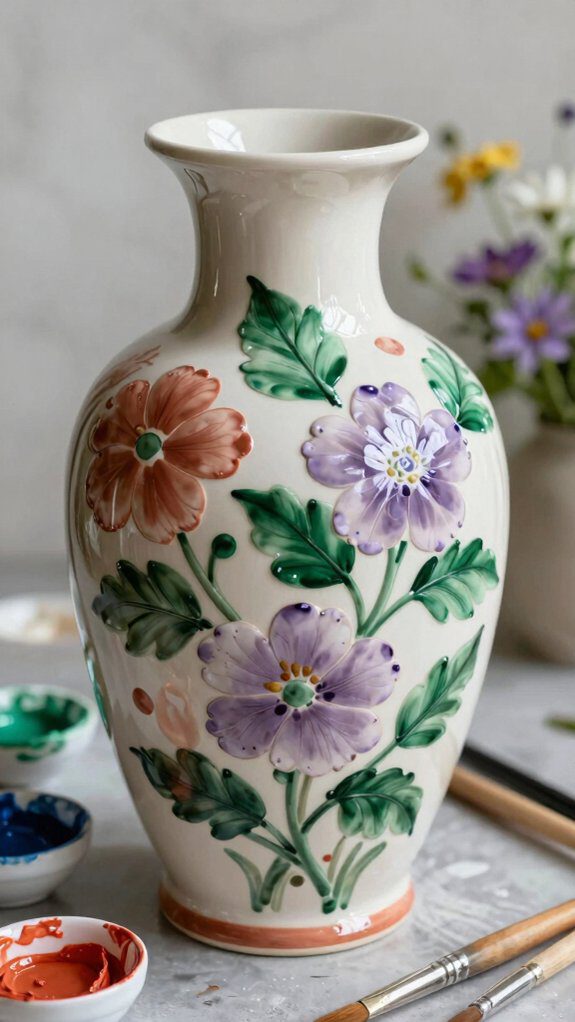
I like starting with simple roses, daisies, or cherry blossoms, then building outward so your piece feels welcoming, like it belongs on our shared table.
To create botanical scenery with confidence, I use these go-to moves:
- Paint one bold bloom, then add smaller buds for balance
- Layer leafy patterns in green and gold for a calm glow
- Switch by season: spring flowers or cozy autumn leaves
- Mix floral patterns with contrasting floral colorways to investigate color theory
- Use painter’s tape for crisp shapes that echo petals and leaves, modern but still natural
Abstract Patterns for Pottery Painting
Although flowers and leaves can feel comforting and familiar, I love switching to abstract patterns because they give you total freedom to play. When you paint this way, you’re joining a big, welcoming club of experimenters, and there’s no “wrong” mark.
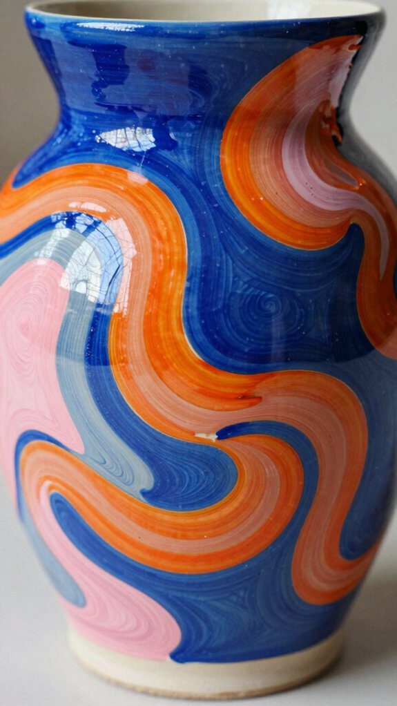
I start with abstract expressionism techniques like splattering, swirling, and quick, loose strokes to build energy fast.
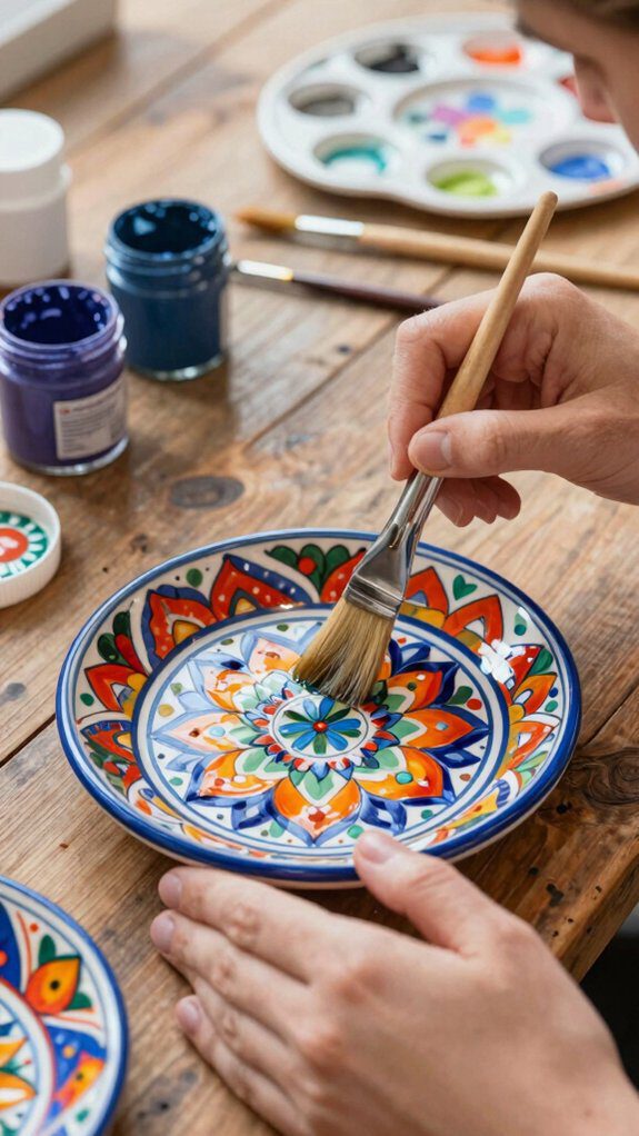
Next, I lean into color theory exploration: pick two contrasting colors, then add one calmer shade to balance them. Use a big brush for bold blocks, then a thin brush to layer lines and dots for depth.
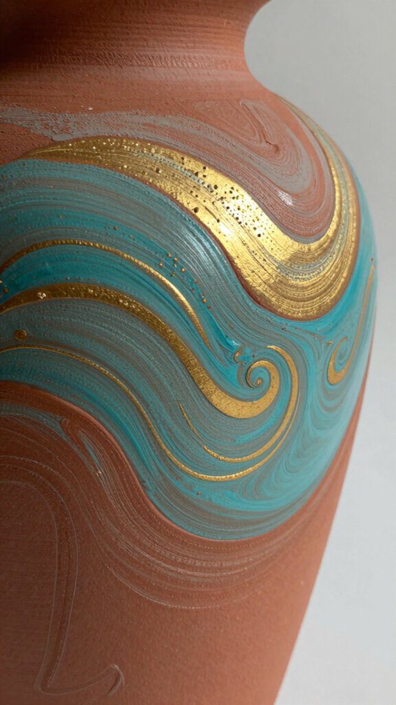
If you want extra sparkle, tap on metallic highlights or add texture with dry-brushing. Step back often, trust your instincts, and let your piece feel uniquely yours.
Cute and Playful Pottery Designs
Abstract patterns give me total freedom, but sometimes I want my pottery to feel like it’s smiling back at me—so I switch to cute and playful designs.
If you’re painting for cozy home decor or a sweet gift, lean into whimsical animal motifs, hearts, and smiley faces so everyone feels included. I start with playful color combinations, then add one main character—like a quirky Frog or a Hungry Caterpillar—to spark nostalgia and chats.
To keep it easy and fun, I rely on:
- Polka dots for quick charm
- Wiggly squiggles for energy
- The Bubbles Technique for underwater texture
- Seasonal add-ons like pumpkins or snowflakes
- Tiny hearts to tie everything together
You don’t need perfect lines; you just need your piece to feel friendly and shared.
Geometric Pottery Painting Concepts
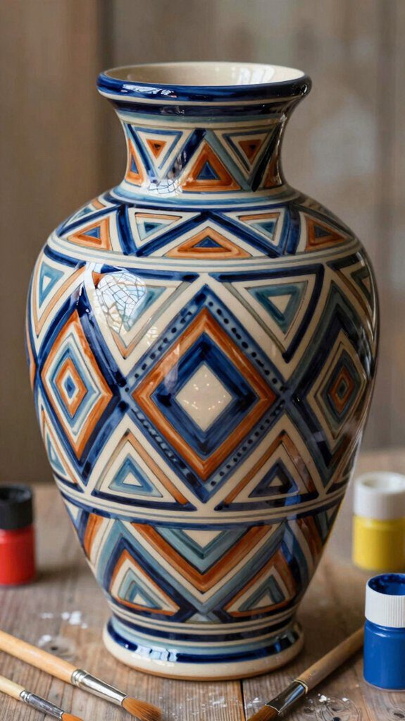
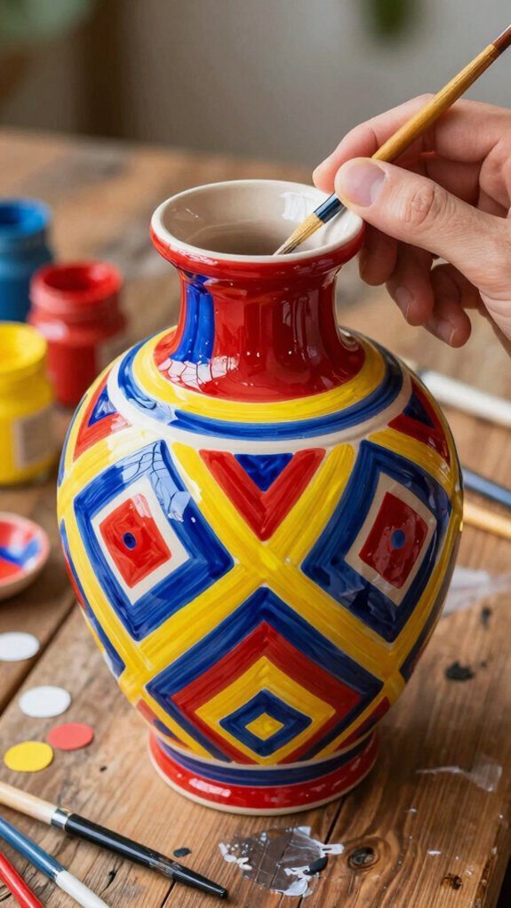
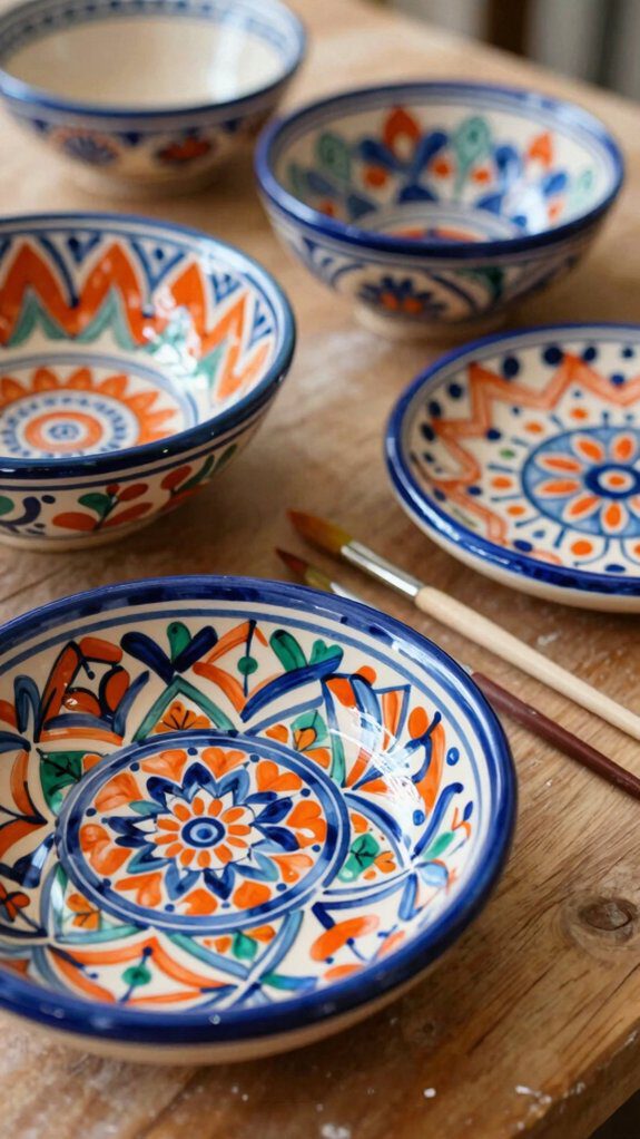
When I want my pottery to look crisp, modern, and a little “designer,” I reach for geometric patterns and let clean shapes do the talking. I use painter’s tape to block off triangles, diamonds, or hexagons, then press the edges down so paint can’t sneak underneath. You’ll get those sharp lines that make your piece feel gallery-ready.
Next, I pick a few bright colors and play with color gradient techniques inside each shape, fading from dark to light for instant depth.
For extra pop, I try shape layering methods: I paint one set of shapes, let it dry, retape, and add a second layer that overlaps. This works on mugs, bowls, and vases, so we can all match our vibe at home.
Neutral and Earth-Tone Pottery Ideas
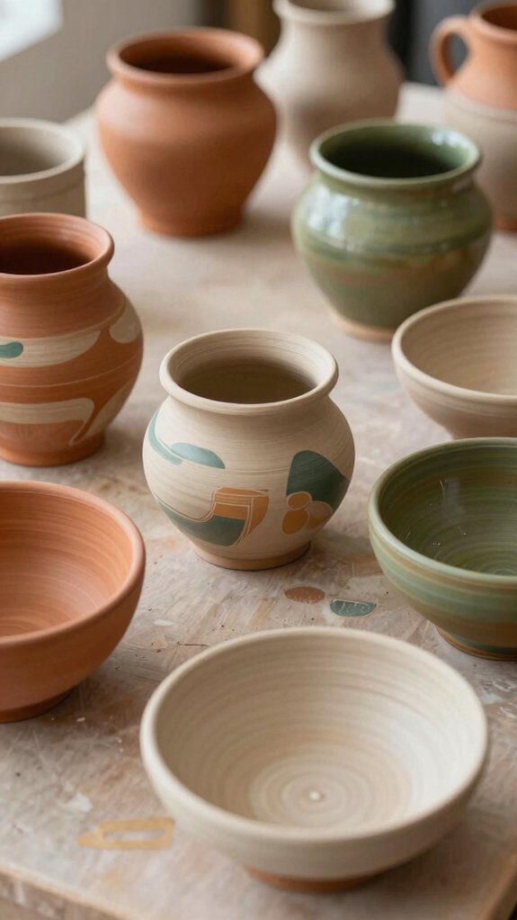
Clean lines look amazing, but sometimes I want my pottery to feel calm and grounded instead of bold—and that’s where neutral and earth tones shine.
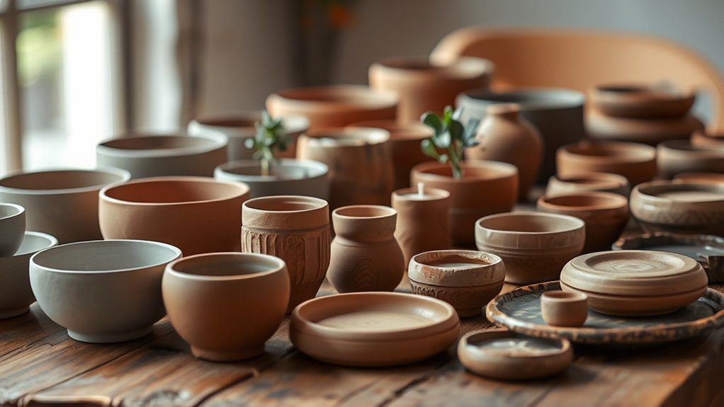
I lean on earthy color palettes—browns, beiges, and muted greens—because they fit right into modern homes and make everyone feel welcome.
To keep it simple but interesting, I use gentle shapes and natural texture techniques that beg to be held.
Try these ideas and you’ll feel like you’re part of a cozy, creative circle:
- Color-block bands in tan and olive for quiet depth
- Soft geometric grids with thin, cocoa lines
- Matte finish paint to calm the shine
- Speckled glaze dots for an organic, sandy look
- Subtle floral motifs, plus leaf prints or stone rubbings
Colorful Pottery Painting for Bold Looks
A bold burst of color can turn a simple mug or plate into the piece everyone picks up first, and I love how fast it changes the whole mood of a room.
If you want that “we made this together” vibe, go bright and fearless.
Start with color blocking: paint big sections of contrasting shades for a modern look. I lean on color theory here—pair opposites like blue and orange to make everything pop.
For motion, try a marbling effect: drip 3–4 colors, swirl with a stick, then stop before it turns muddy. Add splatter for energy; flick a loaded brush for playful dots.
Want crisp style? Use painter’s tape for bold geometric lines. Finish with bright doodles—stars, waves, and quirky shapes—guided by color psychology to set a happy, confident tone.
Pottery Painting Ideas for Kids
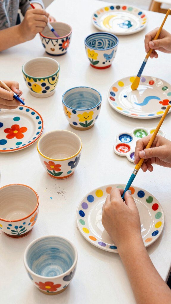
Because kids love seeing quick, colorful results, I keep pottery painting simple, safe, and packed with playful choices they can actually finish in one sitting.
I start with non-toxic, washable paints, then show you a few pottery painting techniques that feel like games, not homework. Simple polka dots and bold stripes build confidence fast, and that confidence feeds kids’ creativity.
- Dotty polka-dot cups using a cotton swab
- Stripey bowls with painter’s tape guides
- Easy animal faces with big shapes and two colors
- Fingerprint flowers or handprint “high-five” keepsakes
- Group murals on a large platter where everyone adds a section
When you paint together, kids share ideas, cheer each other on, and feel like they truly belong.
Seasonal Pottery Painting Themes
Four seasons give me four ready-made pottery painting “playlists,” and I love how each one nudges my colors, patterns, and mood in a fresh direction. When you paint with seasonal inspiration, you’re joining a cozy rhythm we all share—watching nature change and bringing it home.
| Season | Easy theme + colors |
|---|---|
| Fall | Pumpkins, leaves; orange, red, brown |
| Winter | Snowflakes, icy lines; blue, white |
| Spring | Flowers, buds; pastels, bright greens |
| Summer | Watermelons, lemons; bold pinks, yellows |
| Holidays | Pinecones, holly; classic reds, deep greens |
I like turning these into bowls or mugs for gatherings, because festive motifs make great decor and sweet gifts. Try repeating one simple shape around the rim for a pulled-together look.
Aesthetic Pottery Painting Trends
Seasonal themes make it easy to choose colors and motifs, but sometimes I want a look that feels less “holiday table” and more “this is my style all year.”
That’s where today’s aesthetic pottery painting trends shine: I can keep the calm, nature-inspired vibe with simple leaves or soft florals for a soothing piece, lean into cottagecore with pastel washes and tiny, whimsical details for a cozy vintage feel, or go bold with clean geometric lines and punchy color blocks for a modern pop.
If you want a piece that feels like it belongs with your people, try:
- nature inspirations: leafy borders, wildflower dots
- cottagecore aesthetics: milky pastels, mini strawberries
- celestial designs: constellations in fine white paint
- geometric patterns: tape crisp triangles, then fill bright
- whimsical pottery: tiny animals or friendly words
Handmade Gift Pottery Painting Ideas
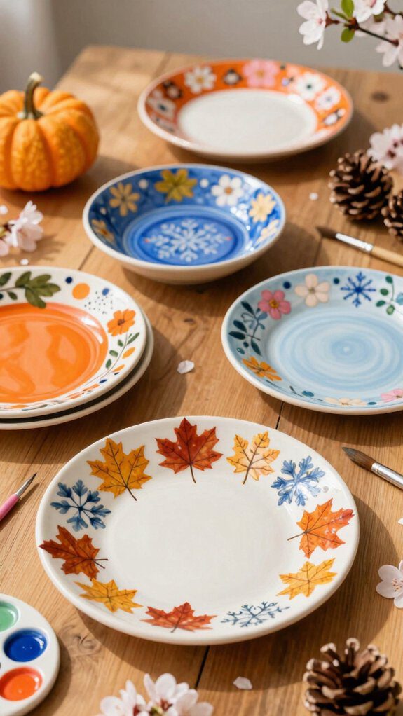
Next, I lean into seasonal themes: paint autumn leaves in warm oranges, or winter snowflakes in icy blues and silvers.
For extra joy, I add a cheeky frog, a smiling star, or another friendly character.
You can also invite family to add handprints or signatures—instant keepsake, shared belonging.
Pottery Painting Ideas for Bowls and Plates
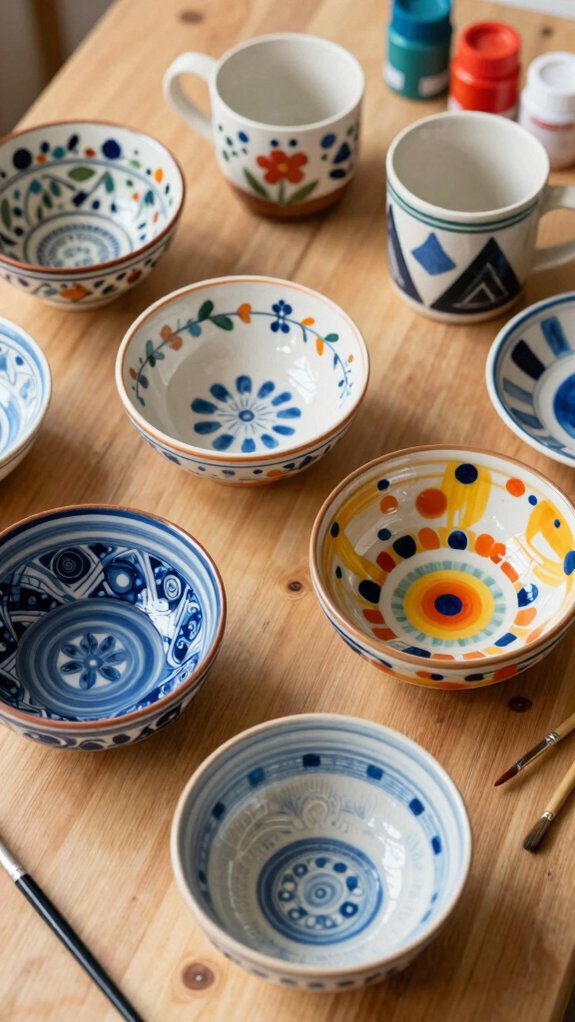
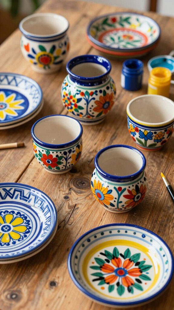
Two of my favorite pieces to paint are bowls and plates, because they’re like blank canvases you actually get to use every day.
When you paint them, you’re joining a club of makers who love shared meals and little details.
- Try bold color blocking: split the surface into big sections with contrasting colors.
- Add animal motifs like a whimsical frog in the center or tiny ladybugs near the edge.
- Use painter’s tape for geometric stripes and triangles, then peel for crisp, pro-looking lines.
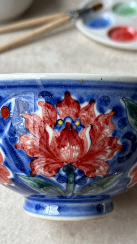
- Paint roses or daisies around the rim for a sweet, special-occasion feel.
- Go seasonal: pumpkins for fall, snowflakes for winter, and keep them in your table rotation.
I always test colors on the bottom first, so the front stays confident.
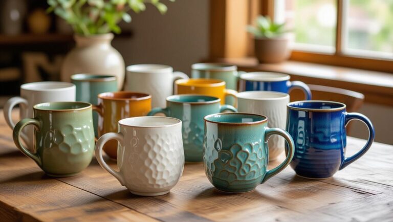
Mug and Cup Painting Concepts
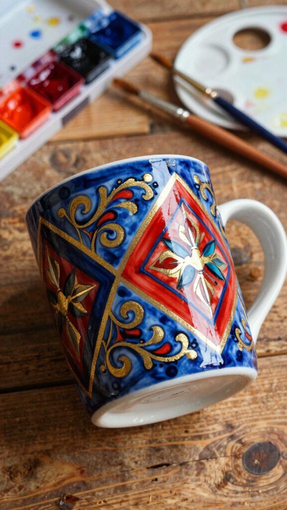
After painting bowls and plates, I love moving on to mugs and cups because you get the same “blank canvas” feeling, but in a piece you’ll hold in your hands every day.
I start with mug personalization techniques: a short quote inside the rim, a bold monogram on the front, or both, so it feels like it belongs to you (or someone you care about).
Next, I add playful patterns—polka dots, clean stripes, or a tiny animal motif that wraps around like a little friend.
For extra wow, try marbling for swirly color or a careful splatter for energy.
Then I match the season: autumn leaves, winter snowflakes, or spring blooms.
If you want whimsy, paint smiley stars or a cat in a bonnet.
Textured and Layered Paint Effects
One of my favorite ways to make painted pottery look truly special is to build it up with textured and layered paint effects, because the surface starts to feel as interesting as it looks.
When you and I add depth, the piece feels like it belongs in our little creative circle. I use sponges, brushes, and even a palette knife to tap, drag, and dab paint into textured layers.
Here are layered techniques I come back to again and again:
- Sponge-stipple a base coat for soft, bumpy depth
- Add two or three coats in different colors for bold layers
- Marble wet paint with a toothpick for swirling movement
- Splatter for playful specks that catch the eye
- Bubble paint or handprints for personal, meaningful texture
I stick with non-toxic, oven-safe paints so the results last.
Common Pottery Painting Mistakes to Avoid
Layered, textured paint can make a pottery piece look amazing, but a few small slip-ups can turn all that hard work into peeling patches or muddy colors. I want you to feel confident in our painting crew, so I dodge these common traps.
| Mistake | What happens | What I do instead |
|---|---|---|
| Paint too thick | Peels, lumpy texture | Build thin coats |
| Dirty surface | Poor paint adhesion | Wipe, dust, dry |
| Rushing layers | Bleeds, smears | Respect drying time |
| Wrong paint | Not oven-safe | Use non-toxic, oven-safe |
| No color test | Surprise shifts | Test a small swatch |
When I slow down and prep well, designs stay crisp, colors behave, and your piece feels like it truly belongs on the “proudly made” shelf with ours.
Finishing and Sealing Painted Pottery
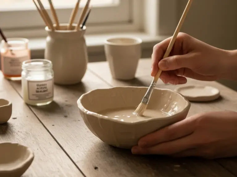
Because paint can look perfectly dry and still smear under your fingers, I treat finishing and sealing as the “lock it in” step that makes all your hard work last.
When you seal, you’re joining a club of makers who protect their art, not just admire it.
Here are my go-to sealing techniques:
- Let the piece dry fully before sealing to stop smudges
- Pick oven-safe sealants made for pottery, with non toxic options
- Choose food-safe sealers for mugs or plates you’ll actually use
- Brush on multiple thin coats, not one thick, gloopy layer
- Cure in the oven exactly as the label says for a tougher finish
Take your time between coats; that patience pays off in a smooth, even shield.
Display Ideas for Painted Pottery
After you’ve sealed your painted pottery and it’s fully cured, the fun part starts: showing it off in a way that feels like *you*.
I like to begin with simple pottery display techniques that help your pieces look like a set, not random stuff.
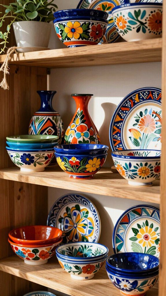
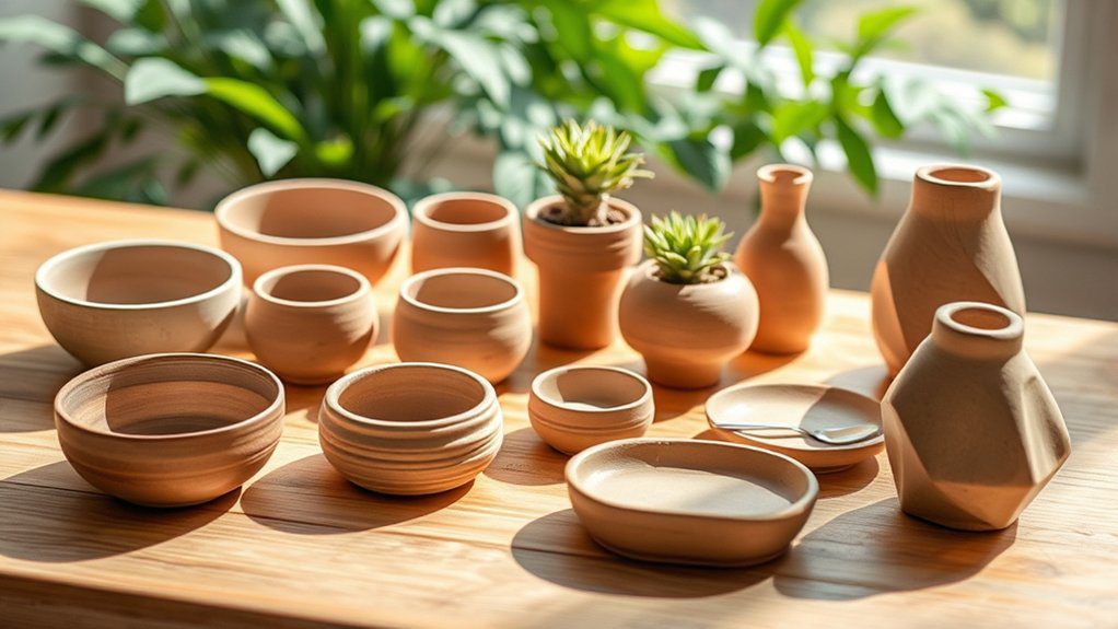
For a bold centerpiece, I group mugs, bowls, and a vase on a decorative tray; it feels collected and welcoming. If you want height, try floating shelves and stagger pieces so each one gets its moment. One of my favorite pottery arrangement tips is mixing sizes: tall vase, medium bowl, small cup.
To blend pottery into daily life, I use pieces as planters for succulents or herbs. You can also hang plates on hooks or mount them to canvas for a mini gallery.

