22 Hand Lettering Art Ideas for Creative Projects
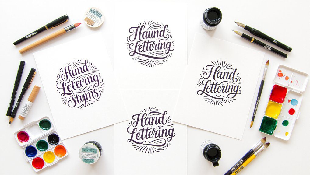
I love sharing hand lettering ideas to inspire your creative projects! Try monoline script for a clean, elegant look or experiment with brush lettering to master smooth strokes. Faux calligraphy offers beautiful designs using simple pens, while block letters make bold, clear statements. You can add flair with gothic blackletter style or playful flourishes for a personal touch. Plus, techniques like 3D shadows and intertwining scripts add depth and flow. Keep going, and you’ll uncover even more fun ways to make your lettering pop!
Love cozy DIY projects? 💕
Get free printable guides, exclusive tutorials & surprise craft goodies straight to your inbox.
Disclosure: This post may contain Amazon affiliate links, at no extra cost to you. Content on DiyCraftNest is created with research support from AI tools and carefully reviewed, edited, and fact-checked by the lead author, Daniel Pat, to ensure accuracy and reliability. Learn more
Key Takeaways
- Explore diverse lettering styles like monoline script, brush lettering, faux calligraphy, block letters, and Gothic blackletter for creative variety.
- Incorporate decorative elements such as elegant flourishes, 3D dimensional letters, and intricate borders to enhance visual appeal.
- Try unique projects like chalkboard hand lettering, intertwined script blends, and artistic mail art envelopes for personalized creativity.
- Use layering, shading, and stroke variations to add depth and movement to your hand lettering designs.
- Join welcoming communities focused on brush lettering and faux calligraphy for skill development and artistic inspiration.
Monoline Script Style
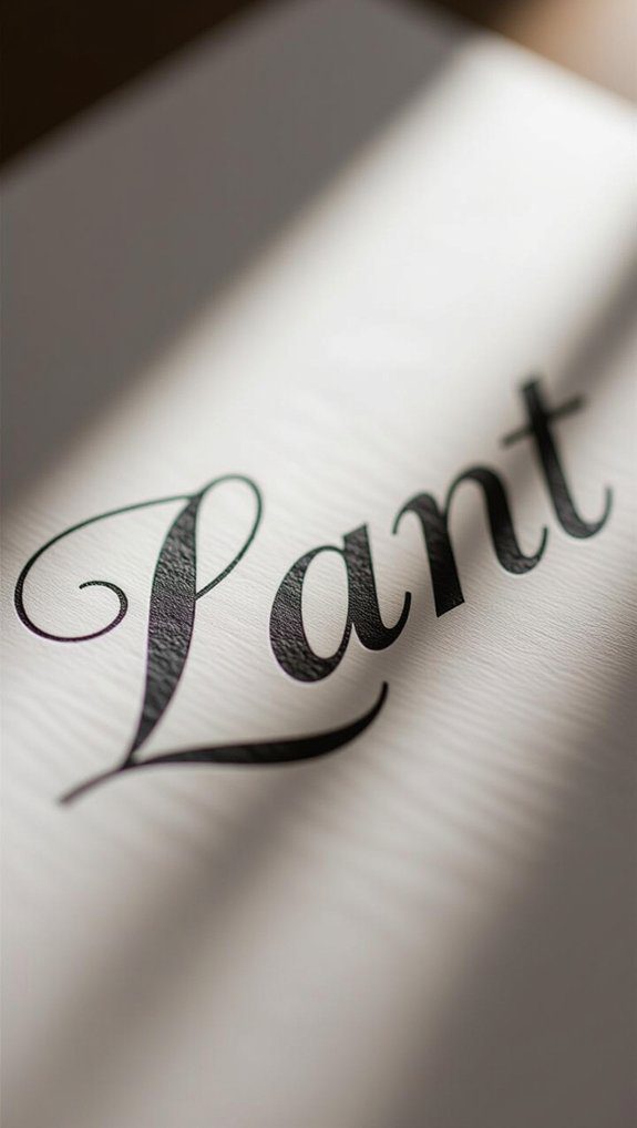
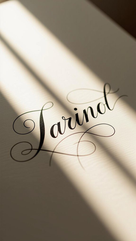
When you want your lettering to look clean and modern without any fuss, monoline script style is a fantastic choice to try. I love how its consistent line width creates smooth, elegant letterforms that feel fresh and easy to read.
Exploring monoline variations lets you play with spacing and arrangement, which adds personality without clutter. You can use this style for invitations, logos, or even minimalist branding—it’s super versatile!
Whether you’re a beginner or seasoned artist, experimenting with creative applications makes your work stand out while keeping that crisp, polished look everyone appreciates. Give it a go!
Brush Lettering Technique
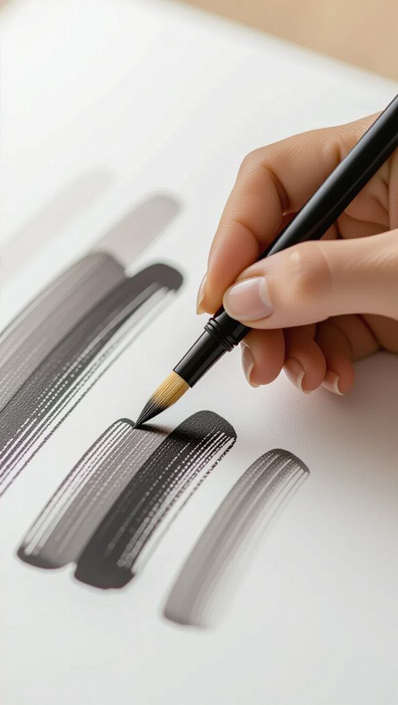
Since brush lettering uses flexible brush pens, it lets you create letterforms that flow and change in thickness with every stroke, making your writing feel alive and expressive.
Starting with brush pen basics like upstrokes and downstrokes is key—they build the foundation for smooth, elegant letters.
I love how creative lettering exercises help me investigate different styles and develop my unique touch.
Whether you’re making cards or art prints, this technique invites you to join a welcoming community of artists who find joy in every curve and line.
Give it a try—you’ll love how your lettering comes alive!
Faux Calligraphy Method
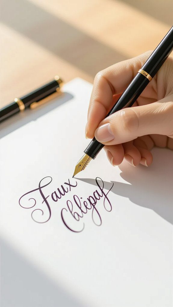
Faux calligraphy offers a fantastic way to create beautiful hand-lettered designs without needing elaborate tools or special skills.
I love how simple faux calligraphy tools—like a regular pen or marker—can transform your lettering by thickening just the downstrokes.
Start by writing your letters normally, then carefully add thickness on those downward lines. This method suits so many faux calligraphy applications, from crafting heartfelt cards to decorating wood signs or canvas art.
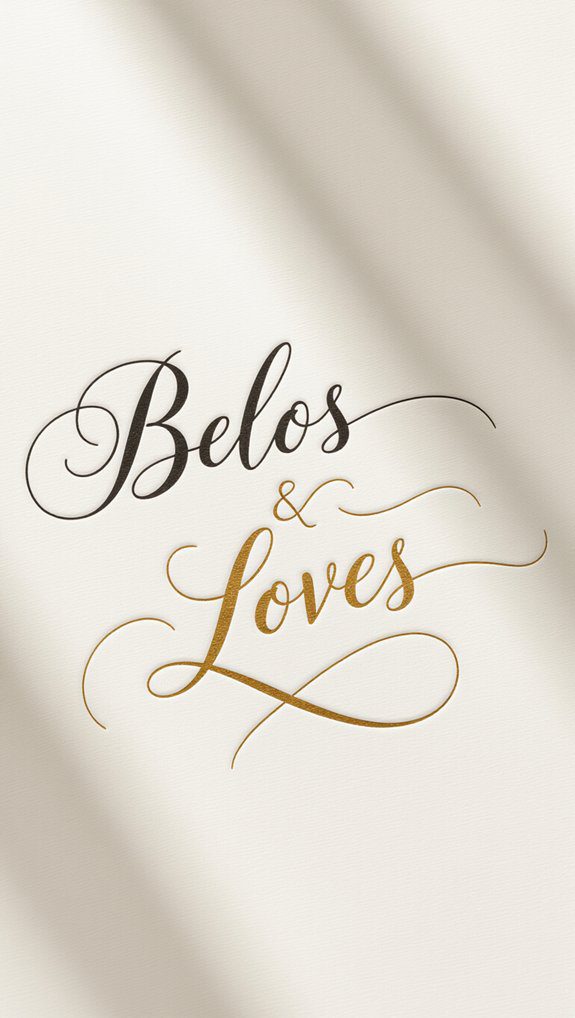
Adding shadows or little flourishes makes your words pop with charm.
Give it a try—you’ll feel part of a creative community in no time!
Block Letter Design
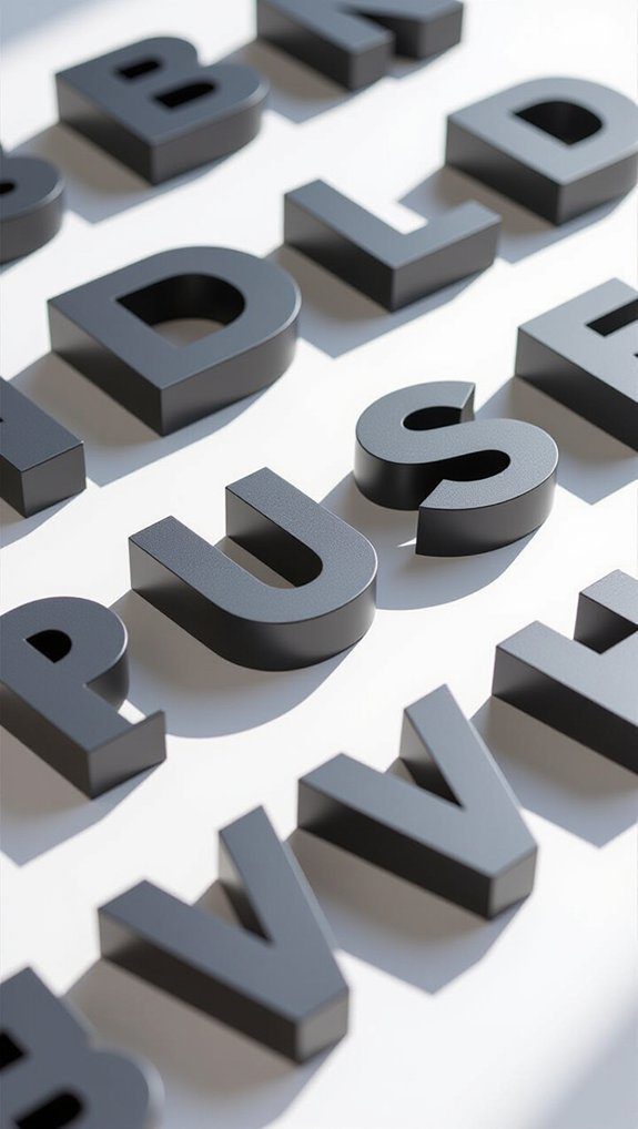
Block letter design grabs attention with its bold, geometric shapes and clean lines, making your words stand out distinctly and confidently.
When I create block letter variations, I play with thickness and size to add depth, keeping spacing consistent for a neat look. Using guidelines really helps me maintain uniform height, which makes the whole piece feel balanced.
To make my letters pop, I like adding block letter patterns—dots, stripes, or even little textures—that bring extra character. This style feels welcoming and strong, perfect for projects where you want your message to connect and shine with clarity and style.
Gothic Blackletter Style
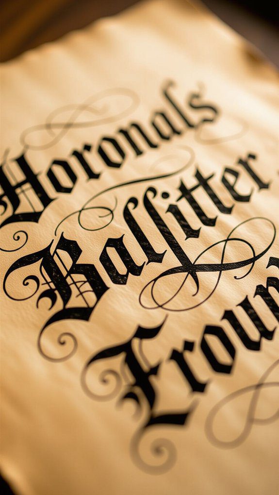
Although Gothic Blackletter style might seem complex at first, it’s a fascinating way to add a dramatic, historic touch to your lettering projects. Inspired by Gothic Inspirations and Historical Manuscripts, this style’s dense, angular letters and sharp serifs create a bold, medieval vibe.
Here’s how I approach it:
- Use a broad-tipped pen for thick and thin strokes.
- Focus on vertical lines to seize that striking look.
- Study historical manuscripts like the Gutenberg Bible for ideas.
- Practice elaborate flourishes to bring elegance and tradition.
Join me in exploring this timeless style—it’s truly rewarding!
Serif Typography Art
Serif typography has a charming way of bringing elegance and clarity to hand lettering projects, and I’m excited to share how you can make it your own. Understanding serif font history helps us appreciate its classic roots and timeless appeal. When crafting your designs, try elegant serif combinations to mix traditional and modern vibes. Here’s a simple guide to get you started:
| Style | Example |
|---|---|
| Shift | Times New Roman |
| Modern | Bodoni |
| Use | Books, invites |
| Feel | Sophisticated |
| Tip | Mix styles |
Embrace serif art for a professional yet warm look!
Bounce Lettering Effect
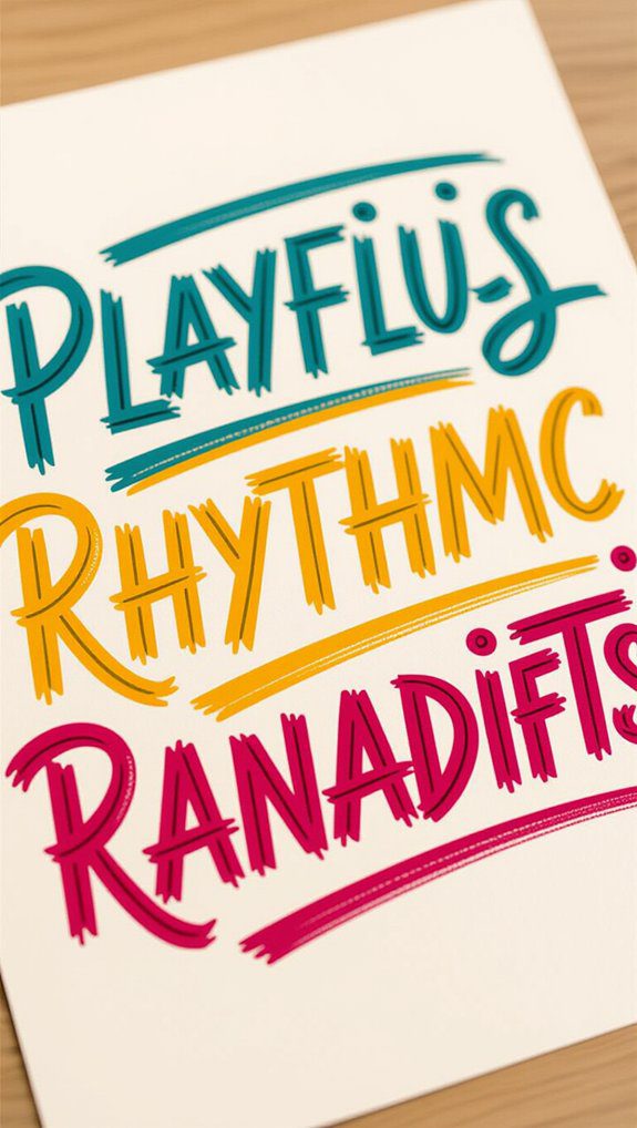
While serif typography offers a polished and classic look, bounce lettering brings a lively and playful spirit to your hand lettering projects.
It’s all about vibrant typography where letters seem to jump off the page, adding fun and energy.
Here’s how I approach bounce lettering:
- Sketch a baseline to guide your letters.
- Vary each letter’s height, letting them rise and fall playfully.
- Keep the overall design balanced so it flows smoothly.
- Experiment by combining bounce lettering with brush calligraphy or watercolor.
These playful designs create warmth and invite everyone to join in the creative fun!
Creative Mixed Styles
When you mix different lettering styles, you open a world of creative possibilities that can really make your artwork pop. I love using mixed media to create unique typography fusion, like combining brush calligraphy with vintage signage or floral typography with modern calligraphy. These combos add charm and personality. Here’s a quick guide to inspire your next project:
| Style Combination | Effect |
|---|---|
| Brush + Vintage | Bold, eye-catching |
| Floral + Modern Calligraphy | Romantic, whimsical |
| Graffiti + Minimalist | Edgy, sleek |
| Watercolor + Geometry | Vibrant, artistic |
Try blending textures and styles for fresh, standout designs!
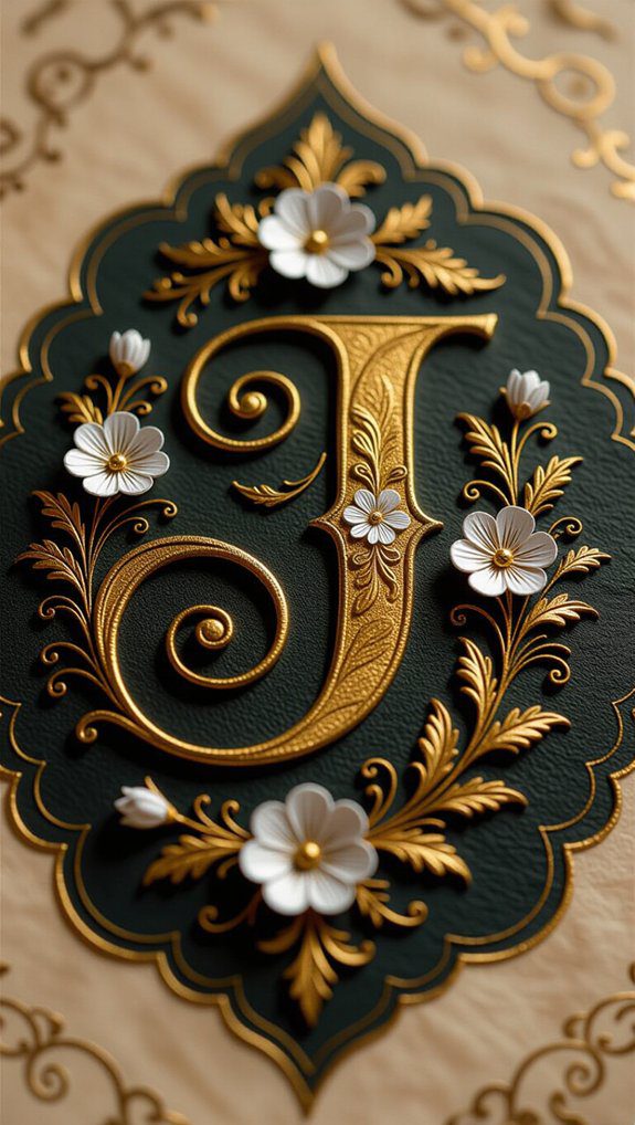
Illuminated Letter Design
Luminous letter design brings a touch of magic to hand lettering by combining rich colors, intricate patterns, and sometimes even shimmering gold or silver accents.
Inspired by medieval inspiration, these embellished letters captivate with decorative motifs that make your work stand out.
Here’s how I approach it:
- Choose vibrant colors reflecting medieval manuscripts.
- Add gold or silver leaf accents for a glowing effect.
- Incorporate nature-inspired motifs like flowers and leaves.
- Use geometric shapes to balance the design.
This style invites you to create hand lettering that truly belongs to a rich artistic tradition.
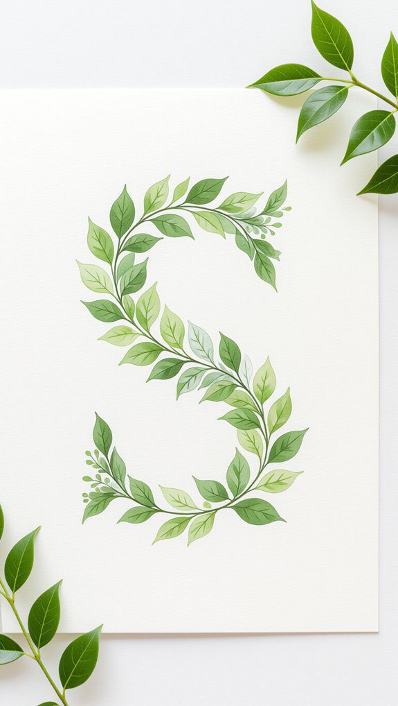
Watercolor Botanical Letter
Watercolor botanical lettering offers a beautiful way to blend the charm of hand lettering with the delicate flow of watercolor painting, creating art that feels alive and fresh.
I start by sketching my letter lightly on watercolor paper, then use watercolor blending to fill in the shapes, letting colors merge naturally like petals.
Once dry, I add fine botanical illustrations around and inside the letters with a thin pen, bringing delicate flower details that make the design pop.
This technique feels so personal and inviting—it’s perfect for gifts, invitations, or just sharing your creativity with friends.
State Lettering Map
Creating a state lettering map is one of my favorite ways to combine art and geography in a fun, creative project. I love how you can outline each state with unique lettering that reflects its state landmarks and cultural symbols.
Here’s how I approach it:
- Choose lettering styles that match the state’s vibe, like vintage for historic places.
- Incorporate state landmarks or flora into your design for detail.
- Use colors that represent the state’s identity.
- Add personal touches like favorite cities or parks.
This project brings us together through shared creativity and exploration!
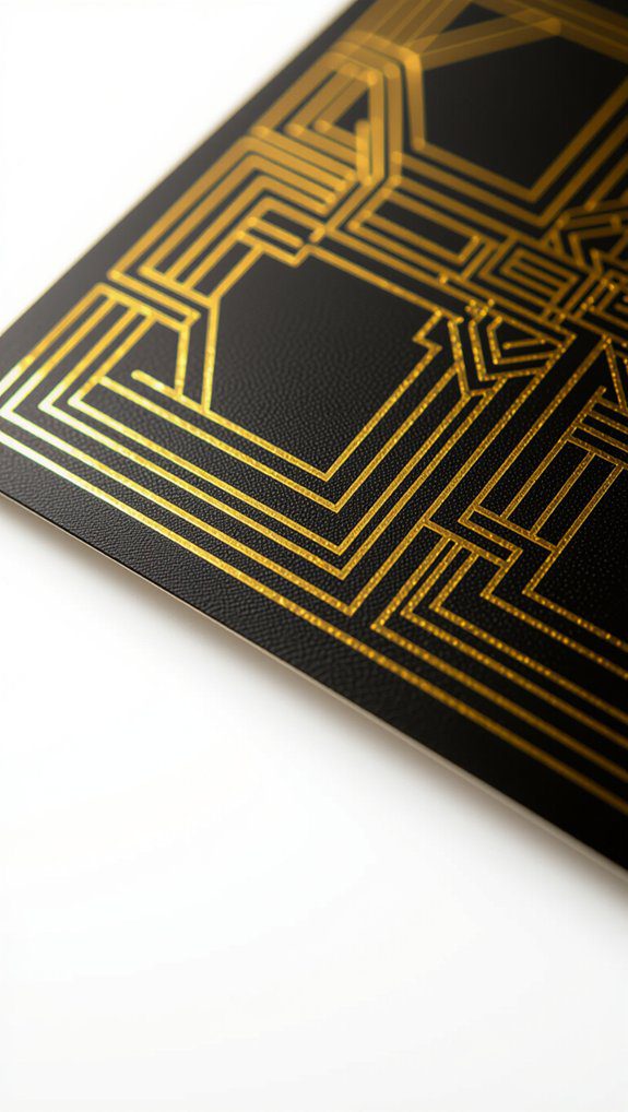
Art Deco Birthday Card
If you want to make a birthday card that truly stands out, the Art Deco style is a fantastic choice to investigate.
I love using bold geometric shapes and vibrant colors to seize that timeless elegance. Adding metallic gold or silver foil instantly boosts the card’s sophistication, reflecting the era’s luxe vibe.
For birthday wishes, I pick stylized, sharp-angled fonts with elegant flourishes—they really pop! Incorporating chevrons, sunbursts, and intricate borders brings the design alive.
Personalizing it with the recipient’s name in a bold Art Deco font makes the card feel extra special and unforgettable.
Try it—you’ll belong to the creative crowd!
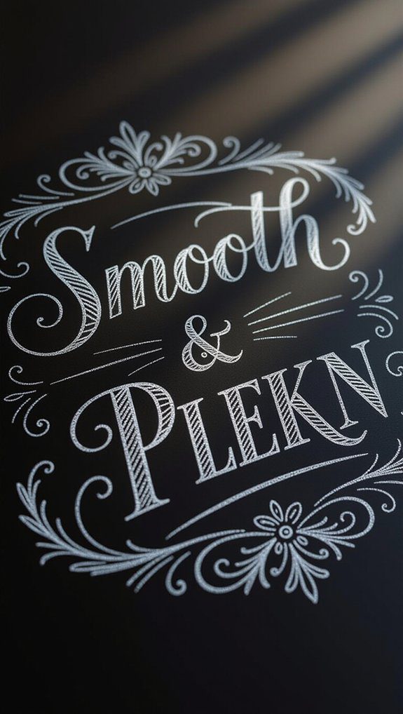
Chalkboard Hand Lettering
Moving from the sleek lines and shiny finishes of Art Deco, chalkboard hand lettering offers a whole different kind of charm that’s casual and inviting.
I love how you can personalize chalkboard quotes and seasonal designs, making each piece feel unique.
Here’s what helps me create eye-catching chalkboard art:
- Mix chalk markers with traditional chalk for texture and depth.
- Practice balancing letters and using negative space wisely.
- Update designs easily for seasons or events, keeping things fresh.
- Embrace the playful, bold style to warm up any space.
This technique truly brings people together through creative expression.
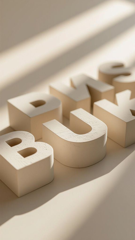
3D Dimensional Letters
Dimensional letters have a way of grabbing your attention by popping right off the page, and I love how they bring an exciting sense of depth to any design.
To create this effect, I focus on layering techniques, stacking parts of letters or overlapping them to add movement and interest. Adding dimensional shadows on one side really helps simulate light and gives the letters a 3D feel.
Using markers or digital tools, I experiment with stroke thickness and shading to improve this depth. Once you get comfortable with these steps, your hand lettering will truly come alive and feel part of a creative community.
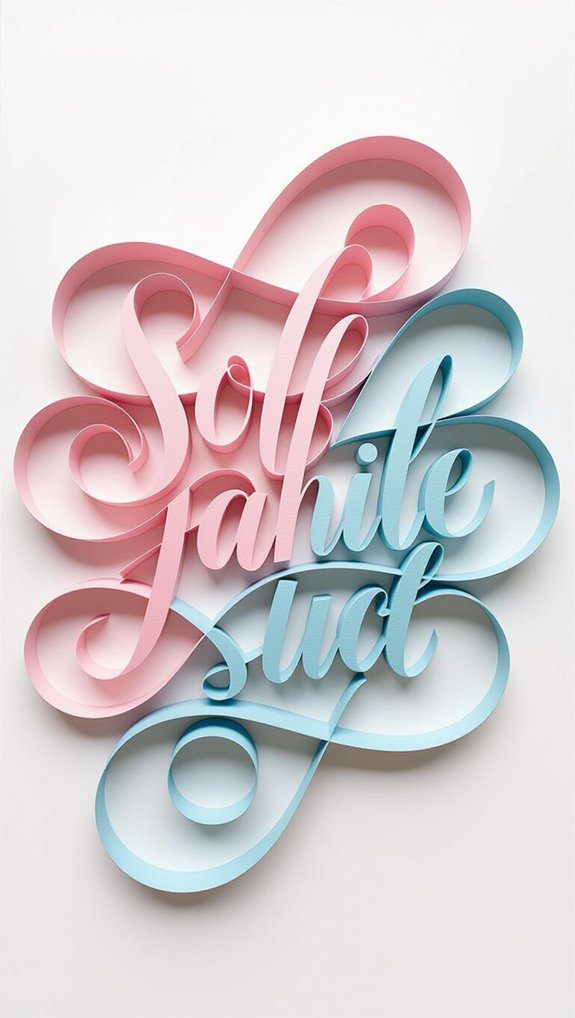
Intertwined Script Blend
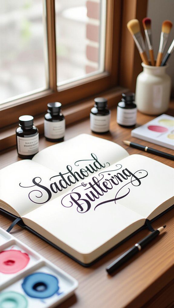
One of the most enchanting hand lettering styles I’ve found is the intertwined script blend, which beautifully mixes cursive and print lettering into a seamless design.
Perfecting intertwined lettering techniques takes patience and artistic flow control. Here’s how I approach it:
- Sketch lightly in pencil to plan your mix of connected and unconnected letters.
- Vary stroke thickness to add movement and depth.
- Practice slowly to improve dexterity switching between styles.
- Ink over your sketch carefully for a polished finish.
This style feels like a personal signature on any project, making us part of a creative community.
Mail Art Envelopes
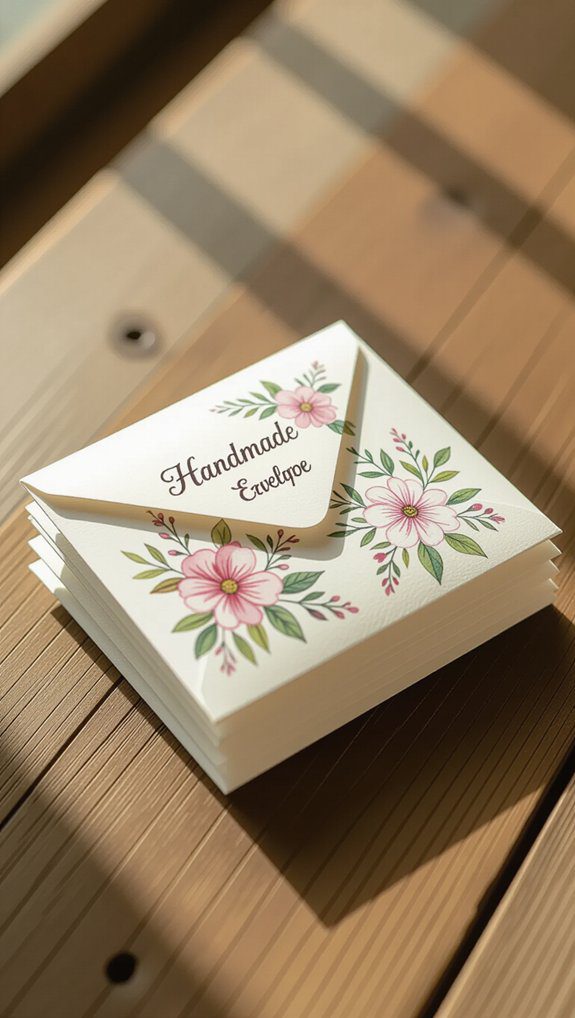
Creating mail art envelopes is a fantastic way to turn an ordinary piece of mail into a little masterpiece that brightens someone’s day before they even open it.
I love transforming artistic envelopes by combining hand-lettered addresses with playful illustrations—this makes creative correspondence truly special. Using brush calligraphy alongside watercolor or colored markers adds vibrant dimension, making each envelope stand out in the mailbox.
Plus, it’s a fun way to practice your hand lettering skills while sharing a personal touch with friends and family. Give it a try—you’ll feel connected and proud sending these unique, heartfelt creations!
Bubble Letter Style
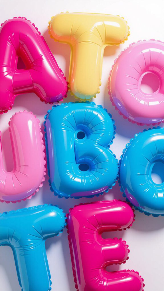
Bubble letter style brings a playful and cheerful vibe to any piece of hand lettering, and I love how approachable it feels for artists of all skill levels.
Bubble letters are perfect for creating playful designs that pop with personality. Here’s why I recommend trying them:
- Rounded, puffy shapes make letters fun and easy to draw.
- Thick outlines add a bold, three-dimensional feel.
- You can customize with colors and patterns for unique looks.
- They blend well with graffiti or cartoon themes to captivate viewers.
Give bubble letters a shot—you’ll feel part of a creative community in no time!
Shadow Outline Effect
While adding shadows might seem tricky at first, I promise it’s a fun way to make your letters pop off the page with extra depth and dimension.
Start by sketching your letters lightly in pencil, then use shadow placement techniques like adding shadows along the left edges to mimic light coming from the right. Experiment with shadow color variations, such as grays or muted blues, to create unique looks.
Varying the thickness of your shadow lines adds energy and interest. This versatile shadow outline effect works great for cards or wall art, helping your designs feel more alive and inviting.
Flourish Decorated Letters
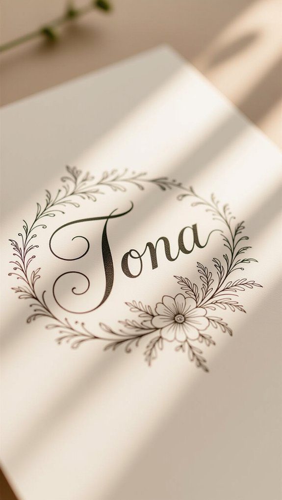
Flourish decorated letters bring a delightful touch of elegance and creativity to your hand lettering projects.
Using flourish techniques, you can transform simple text into stunning art with elegant embellishments. Here’s how I approach it:
- Start with clean, basic letterforms as your foundation.
- Add swirls, curls, or botanical motifs carefully to avoid clutter.
- Use tools like brush pens or fine liners to experiment with line thickness.
- Always check for balance and legibility, making sure the flourishes improve rather than hide your letters.
Together, these steps make your lettering feel personal, elaborate, and inviting.
Dot Marker Technique
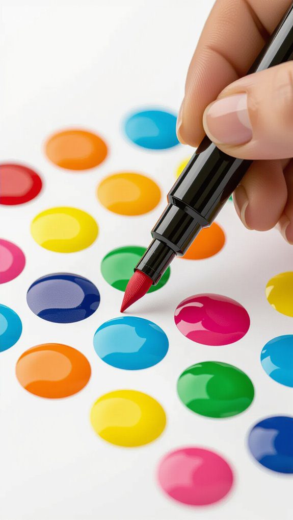
The dot marker technique brings a fun and colorful twist to hand lettering that anyone can try, no matter their skill level.
I love using dot marker techniques to add vibrant color combinations that really make letters pop. You can fill in letters, create playful backgrounds, or add decorative dots around your words.
It’s easy and relaxing, perfect for beginners and pros alike. Plus, mixing dot markers with other lettering styles creates eye-catching designs that feel truly unique.
Practicing this helps me improve hand-eye coordination while exploring endless color combos. Give it a try—your projects will instantly brighten up!
Gold Leaf Embellishment
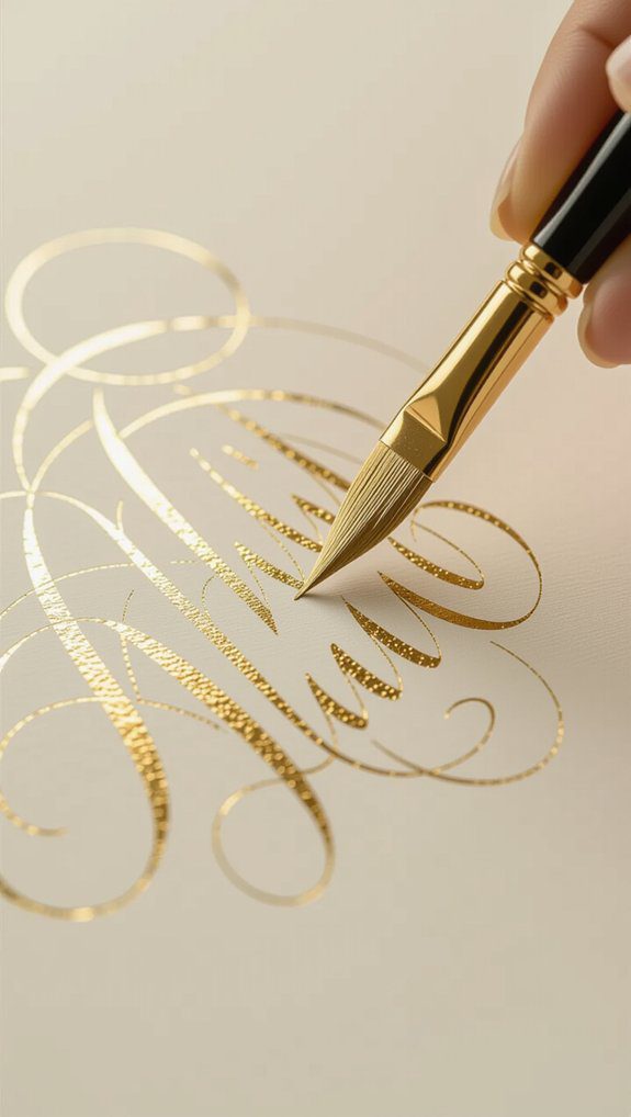
Gold leaf embellishment gives your hand lettering projects a stunning, luxurious touch that really catches the eye.
If you want to master gilded lettering, follow these gold leaf techniques:
- Prepare your surface by cleaning and smoothing it for a flawless finish.
- Apply a special adhesive called size, which helps the gold leaf stick perfectly.
- Choose your gold leaf form—sheets, flakes, or pens—to suit your style.
- Gently press the gold leaf onto the adhesive, then brush away the excess.
These steps make your projects feel special and invite you into a creative community that loves a little sparkle.
Colored Two-Tone Lettering
Nothing livens up hand lettering quite like colored two-tone lettering—it’s a simple trick that instantly adds depth and excitement to your designs. Using color blending techniques with contrasting color combinations, you can create eye-catching effects by layering a base color with a bold outline or shading. This method works beautifully on cards, invitations, or prints, making your words pop with personality.
| Base Color | Outline/Shading Color |
|---|---|
| Soft Pink | Deep Purple |
| Bright Yellow | Cool Blue |
| Mint Green | Warm Coral |
Try different pairs to find your perfect match!

