18 Hand Lettering Inspiration for Beginners and Artists
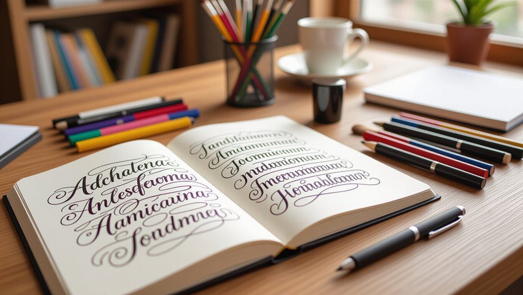
If you’re starting or looking to expand your hand lettering skills, I recommend trying styles like monoline script for clean, consistent lines, and flourished script to add charming loops with brush pens like Pentel Touch. Chunky faux calligraphy makes quotes pop, while print style keeps things simple and clear. You can also investigate elegant bouncy scripts or fun doodle decorations for personality. Practicing these can build confidence fast, and there’s plenty more creative tricks to discover as you go!
Love cozy DIY projects? 💕
Get free printable guides, exclusive tutorials & surprise craft goodies straight to your inbox.
Disclosure: This post may contain Amazon affiliate links, at no extra cost to you. Content on DiyCraftNest is created with research support from AI tools and carefully reviewed, edited, and fact-checked by the lead author, Daniel Pat, to ensure accuracy and reliability. Learn more
Key Takeaways
- Start with Monoline Script Style for clean lines and spacing practice, ideal for beginners building foundational skills.
- Experiment with playful chunky faux calligraphy using bold strokes and colorful effects to create standout quotes and titles.
- Incorporate decorative doodle elements like stars and hearts to add personality and balance empty spaces in your designs.
- Use shadow outline effects with consistent light positioning to give your lettering a dynamic, three-dimensional appearance.
- Practice connected script flow with flexible brush pens to achieve smooth, natural letter linking and elegant curves.
Monoline Script Style
Although it might seem simple at first glance, Monoline Script is a fantastic starting point if you’re new to hand lettering. I love how its clean lines help me focus on spacing and consistency, key skills that build confidence.
Exploring Monoline variations lets you experiment with different pen types, like the Monomi +3000 or paint pens, which really brighten your work. Plus, Monoline applications are everywhere—from greeting cards to planners—making this style super practical.
If you want to join a friendly community of learners, perfecting Monoline Script is a solid step that welcomes you into the world of hand lettering.
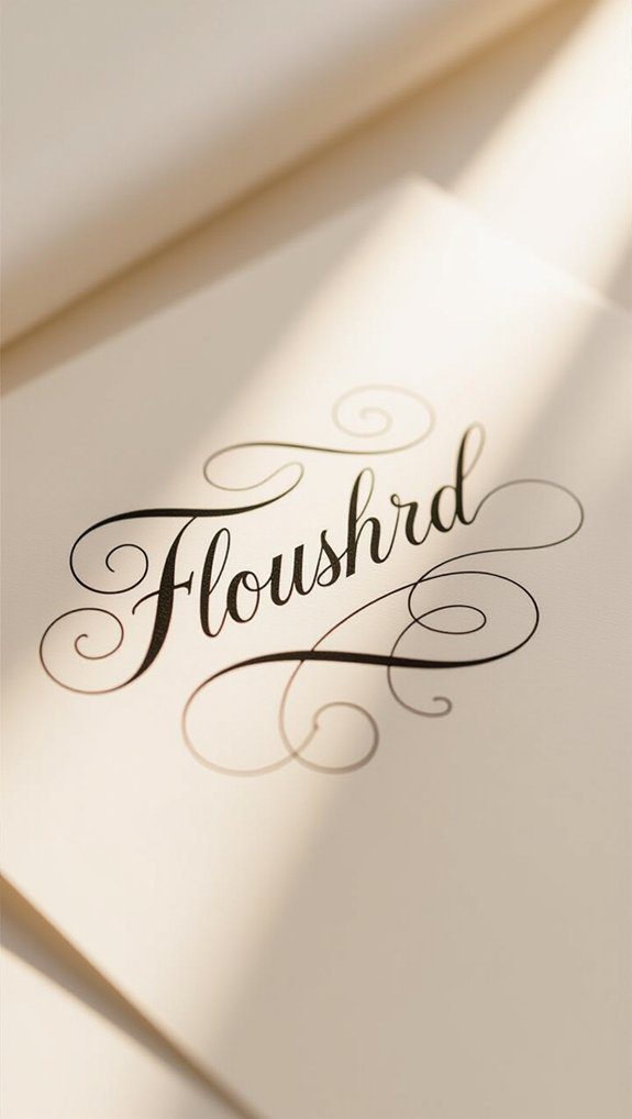
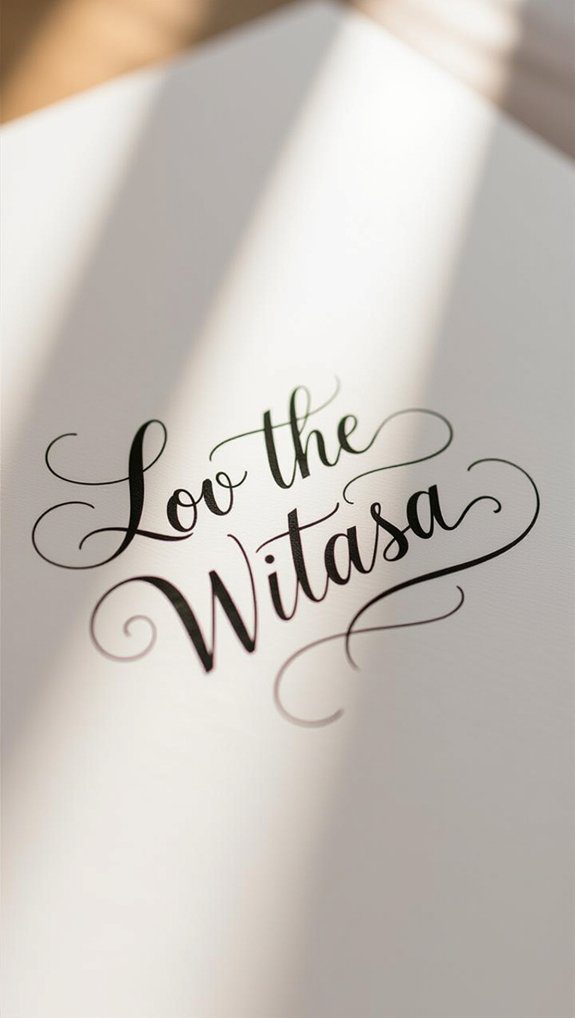
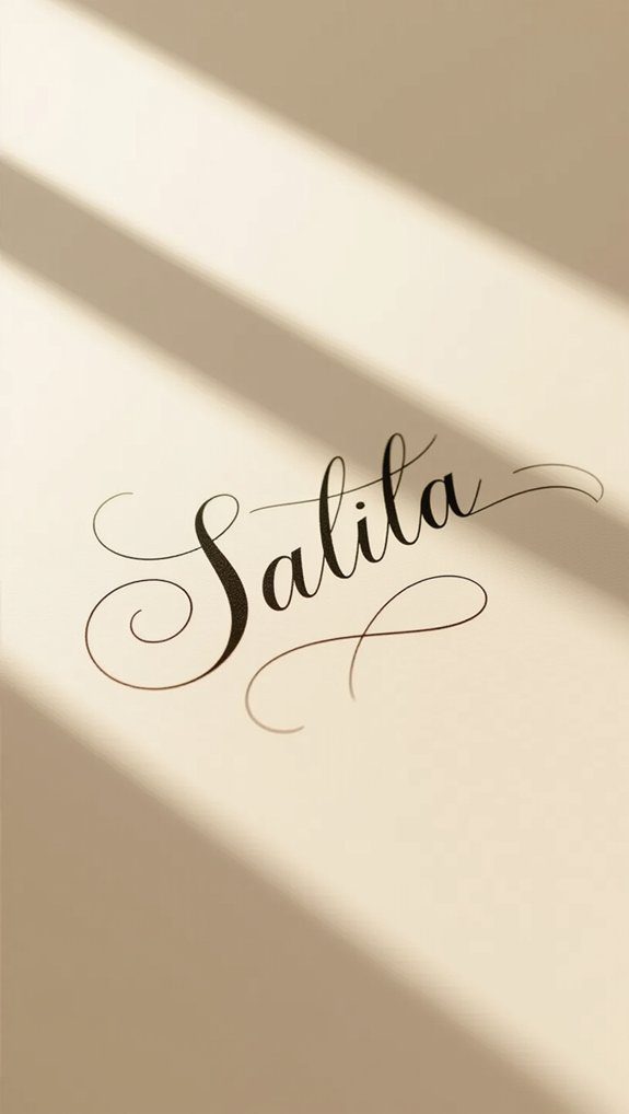
Flourished Script Technique
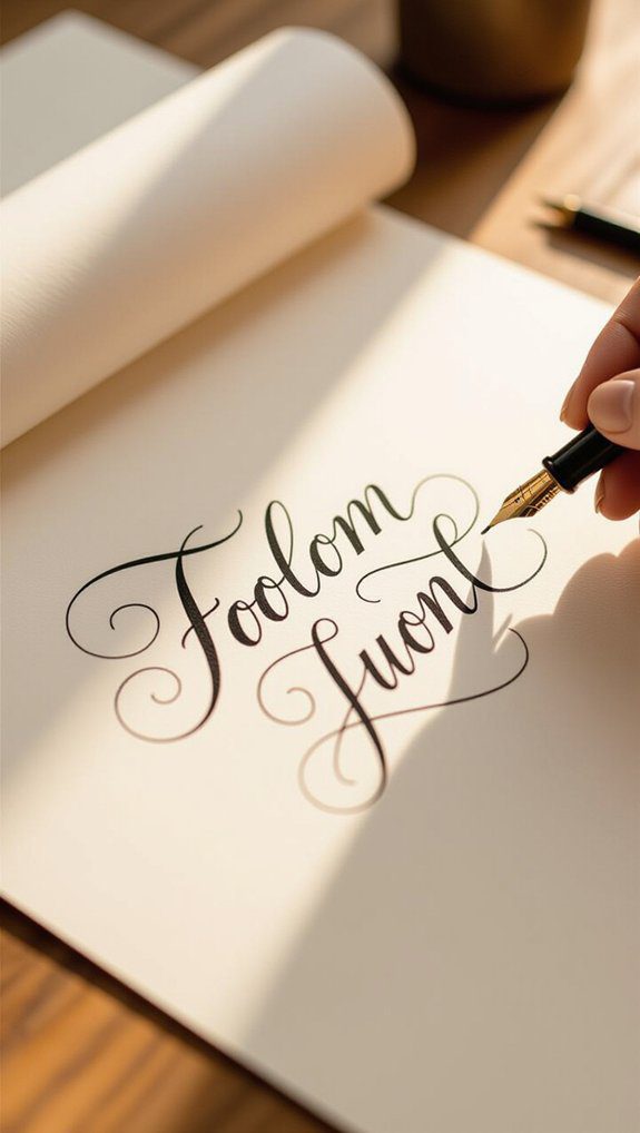
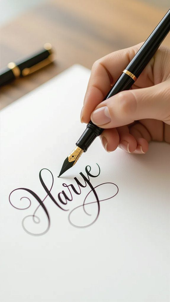
Once you’ve gotten comfortable with the clean, steady lines of Monoline Script, adding some flair with Flourished Script can really bring your lettering to life.
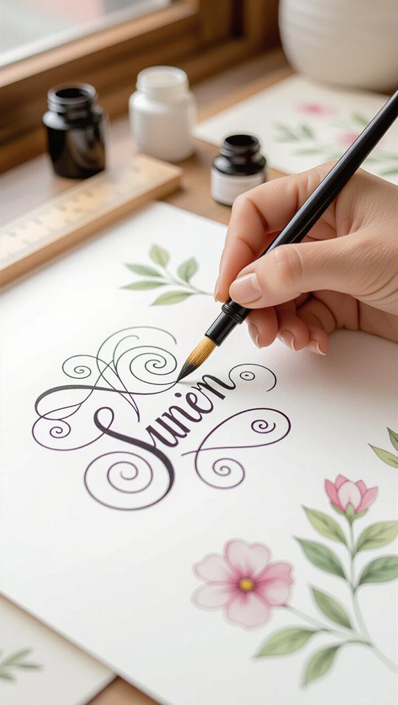
Flourished letters have charming loops and swirls that add personality without extra decoration. I love using a brush pen, like the Pentel Touch, because it lets me control thick and thin lines smoothly.
When practicing, focus on rhythm and flow—each curve should feel natural, not forced. If you’re just starting, resources like “Hand Lettering for Beginners” can guide you through perfecting those elegant flourishes.
Together, we’ll make your lettering truly stand out!
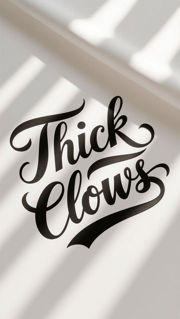
Chunky Faux Calligraphy
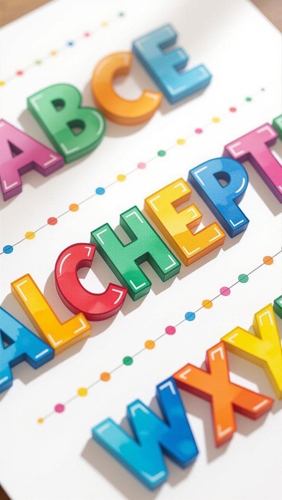
Chunky faux calligraphy is a playful and vibrant style that I absolutely love for adding bold personality to any lettering project.
Its larger, open letterforms make it perfect for beginners, offering beginner tips like using Tombow Dual Brush Pens with bullet tips to create thick, colorful patterns inside each letter.
What’s great is you can personalize your work by adding galaxy or rainbow effects, turning simple words into eye-catching statements.
This style’s boldness helps your favorite quotes or titles really stand out.
Trust me, once you try chunky faux calligraphy, you’ll feel part of a creative, welcoming community enthusiastic to share!
Print Style Lettering
Print style lettering lays a solid foundation for anyone enthusiastic to master more complex script styles, and I find it’s one of the best starting points for beginners.
When diving into print style techniques, here’s what I love about it:
- It’s simple and clear, perfect for all skill levels.
- Tools like the Marvy LePen Flex help create consistent lines.
- Practicing print style applications improves spacing and balance.
- Earthy tones make your work feel warm and connected.
Joining this lettering community means building confidence with every stroke.
Ready to investigate print style? Let’s do it together!
Elegant Script Method
If you’ve enjoyed perfecting print style lettering, you’ll find the Elegant Script method a delightful way to add a bouncy, flowing charm to your work.
I love how Elegant Script techniques bring a classy, sophisticated vibe to everything from invitations to personal notes. Using Faber Castell Pitt Artist Brush Pens, you can easily vary stroke size and letter height, making your style versatile.
When starting out, tracing examples really helped me build muscle memory and smooth connections between letters. Remember to keep a consistent slant—that’s key!
Exploring Elegant Script applications together makes this experience even more fun and rewarding.
Brush Pen Faux Calligraphy
Anyone interested in adding a bit of flair to their lettering will find brush pen faux calligraphy a fun and approachable technique to try.
Here’s how I recommend starting with brush pen techniques:
- Write your word lightly in pencil.
- Add a second line beside each downward stroke to create thickness.
- Fill the space between with color or patterns, experimenting with color blending.
- Practice consistently using Tombow Fudonosuke Brush Pens for clean, precise strokes.
This method brings energetic style and depth to your letters, making you feel part of a creative community enthusiastic to investigate and grow together.
Negative Space Lettering
After playing around with brush pen faux calligraphy, you might enjoy switching things up by investigating negative space lettering.
This style uses negative space techniques to shape letters by filling in the area around them instead of the letters themselves. By using creative contrasts—like dark backgrounds with light letter outlines—you make your designs really pop.
I love sketching letter outlines first, then adding patterns or colors around them, leaving the letters empty. It’s a fun way to experiment and see how positive and negative spaces play together.
Give it a try—you’ll join a creative community enthusiastic to discover new lettering styles!
Fat Filler Flower Style
One of the most fun ways to bring your lettering to life is by trying the Fat Filler Flower Style, which combines bold, chunky letters with lovely floral designs inside them.
This style uses floral letterforms filled with vibrant patterns that instantly brighten any project. Here’s how you can get started:
- Draw large block letters as your base.
- Fill them with hand-drawn floral designs using a black waterproof pen.
- Add color with watercolor or colored pencils for depth.
- Practice often to improve both lettering and floral skills.
You’ll feel part of a creative, supportive community as you grow!
Block Letter Design
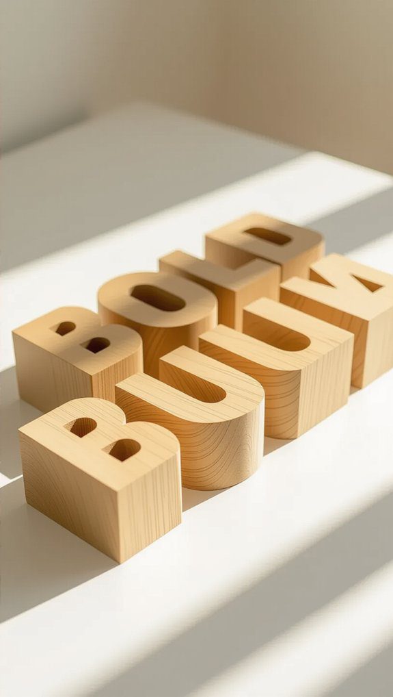
Block letters are a fantastic starting point if you’re new to hand lettering, because their clean, straight lines make each letter easy to shape and recognize.
I like to begin with simple geometric shapes and use a ruler to keep everything consistent. Exploring block letter variations—like rounded edges or sharp corners—adds personality to your work.
Don’t be afraid to play with thickness, shadows, or colorful patterns; these tricks give your letters depth and make them pop.
Trust me, experimenting with these basics helps you build confidence and creates a solid foundation for your lettering adventure.
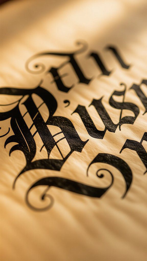
Gothic Blackletter
Though Gothic Blackletter might seem intimidating at first, I promise it’s a rewarding style to investigate once you get the hang of its unique shapes and strokes.
Its rich Historical Context adds depth, connecting us to centuries of Typography Evolution and Cultural Significance.
When practicing, focus on these key aspects:
- Master the Gothic Flourishes and intricate Lettering Techniques using proper Calligraphy Tools.
- Keep consistent letter height and spacing with solid Design Principles.
- Examine Artistic Applications like logos or tattoos for Modern Adjustments.
- Embrace its bold Visual Aesthetics to belong to a creative community celebrating tradition.
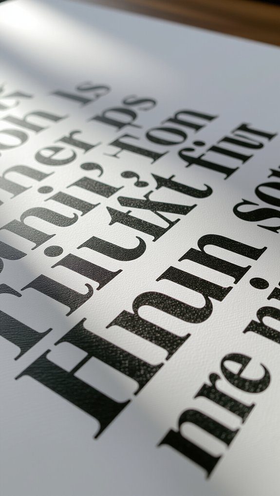
Serif Lettering Art
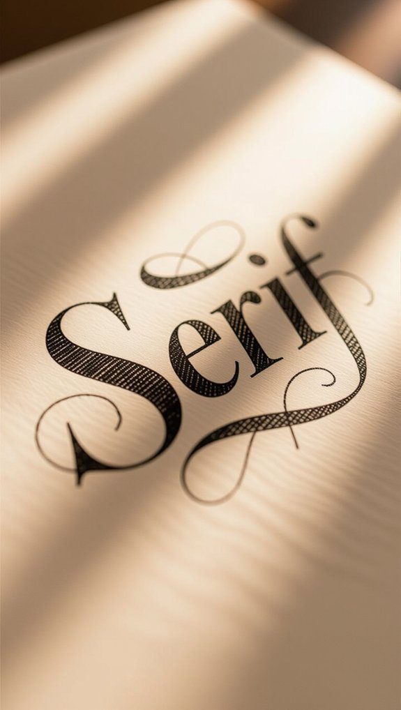
Serif lettering art brings a touch of elegance and charm to your hand lettering projects, thanks to the small decorative strokes called serifs that finish off each letter.
I’ve found practicing various serif styles helps me understand their thick-and-thin stroke contrast, making my letters pop with personality. Using guidelines keeps my spacing and height consistent, which is key for clean, polished work.
Serif applications are everywhere—from invitations to book covers—so perfecting this style connects you with a timeless tradition.
Start by tracing serif fonts you love; it’s a friendly way to build confidence and create your own unique designs.
Bounce Lettering Style
When you want to add a playful and lively touch to your hand lettering, bounce lettering style is a fantastic choice. This style’s charm lies in its irregular baseline, making letters appear like they’re happily bouncing.
Here’s how I approach bounce lettering techniques:
- Sketch a baseline to guide your letters’ rhythm.
- Place letters above and below it, varying heights for that playful feel.
- Use brush pens or markers for smooth thickness changes.
- Apply playful lettering applications in cards or social media.
Together, these steps create a joyful, vibrant design that truly connects with your audience.
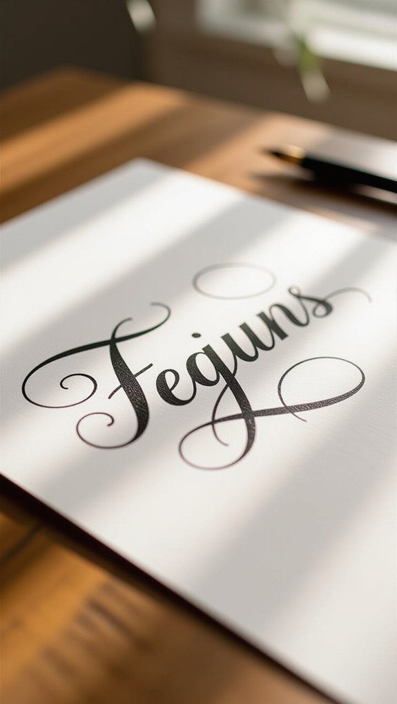
Connected Script Flow
If you enjoyed the lively bounce lettering style, you’ll love exploring connected script flow next. This lettering technique links letters smoothly, creating a graceful, continuous line that feels like writing a secret message.
Using script variations with loops and curves adds personality, making your work uniquely yours. I found that practicing with a flexible brush pen, like the Tombow Dual Brush Pen, helps control line thickness and improves muscle memory.
Beginners should start by tracing connected scripts, then move to freehand, building confidence and style. Together, these lettering techniques invite you into a warm, creative community that grows with each stroke.
Shadow Outline Effect
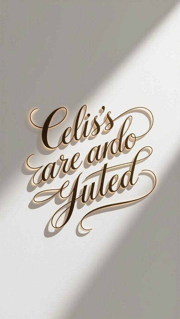
Although adding depth to your hand lettering might sound tricky, the shadow outline effect is a fantastic way to make your letters pop and feel more three-dimensional.
Here’s how I like to nail it:
- Choose shadow color choices that complement your main letter—lighter shades often work best.
- Use shadow positioning techniques by placing shadows consistently, usually to one side or below, to mimic real light.
- Outline letters first with a dark pen for definition.
- Experiment with opacity for soft or bold shadows.
Try this, and you’ll see your lettering truly come alive, connecting you with every stroke!
3D Curved Letters
Curved letters, like the elegant “D,” have a way of adding softness and flow to your hand lettering that’s hard to beat.
When practicing the “D,” pay close attention to its curved letter anatomy—the rounded stroke that loops smoothly from the stem. Using a flexible brush pen helps create lively stroke variation, making your “D” visually vibrant and balanced.
I like to use guides to keep my curves consistent, which really builds confidence. Remember, perfecting these curves connects you to a community of artists who appreciate the beauty in every stroke.
Keep practicing, and watch your letters come alive!
Doodle Decoration Elements
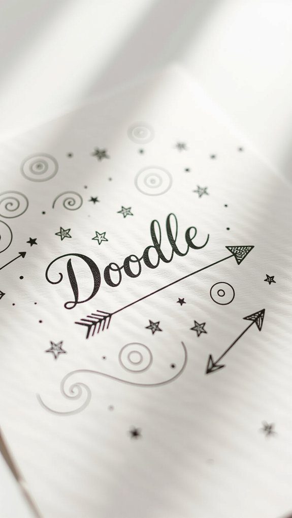
Adding just a few doodle decoration elements can bring your hand lettering to life in ways you mightn’t expect. Doodle integration adds personality and fills spaces beautifully.
Here’s how I approach it:
- Pick simple doodle styles like stars, hearts, or flowers to complement your letters.
- Use doodles to balance empty spaces, making your design feel complete and inviting.
- Experiment with different sizes to add depth and keep your work unique.
- Practice doodling alongside lettering to build confidence and enjoy the process.
Together, these tips create hand lettering that feels personal and welcoming—just like a creative community.
Simple Cursive Style
One of the easiest and most rewarding ways to start hand lettering is by perfecting a simple cursive style.
I found that focusing on smooth cursive letter formation really helps, especially when you keep a consistent slant and letter height using light pencil guidelines.
Don’t be afraid to add your own touch with creative loop integration—gentle curves and loops add personality without complicating things.
Practice common words repeatedly to build muscle memory and confidence.
Whether using a regular pen or a brush pen, this flowing, connected style welcomes beginners while letting your creativity shine through every letter.
Creative Mixed Styles
While mixing different hand lettering styles might seem intimidating at first, it’s actually one of the most exciting ways to make your work stand out and express your unique style.
Creative contrasts and style combinations add depth and personality to your lettering. Here’s how I like to blend styles:
- Pair Monoline Script with Flourished Script for lively flair.
- Mix Basic Script and Elegant Script to balance simplicity and sophistication.
- Use Brush Pen Faux Calligraphy with Print Style for texture and impact.
- Combine Serif and Sans Serif for a modern, professional look.
Try these and join the creative lettering community!

